
SaaS UI/UX Design: Best Practices for Enterprise Apps in 2026
UI/UX Design for
SaaS Applications.
Designing SaaS products that reduce churn, increase adoption, and drive growth. Most SaaS products don't collapse because of code. They collapse because people don't want to use them.

The Reality
SaaS products are not marketing sites. They are environments people work inside every day. The interface cannot just look polished. It has to reinforce clarity, reduce friction, and make complexity feel manageable.
What UI/UX Design for SaaS Actually Is
UI/UX design for SaaS applications is fundamentally different from designing websites, landing pages, or mobile apps. SaaS products are tools. People rely on them daily to complete workflows, manage data, collaborate with teams, and make decisions under pressure.
That changes everything. SaaS UX is not about making a quick impression. It is about creating an experience that remains clear, fast, and intuitive over repeated use.
A strong SaaS interface helps users orient themselves immediately. It reduces cognitive load. It supports complexity without becoming chaotic. It gives people confidence that they understand where they are, what they are looking at, and what to do next.
An experience that remains fast and intuitive over repeated daily use. Hierarchy, structure, and usability built to grow as the product grows.
A landing page can afford to be beautiful and shallow. SaaS products cannot. The interface needs to perform under real workflow pressure, every single day.
A poorly designed SaaS product doesn't just look bad. It costs you users.
Why UI/UX Design Is Critical for SaaS Success
Most SaaS companies invest aggressively in engineering, infrastructure, integrations, and features. Then they underinvest in the experience layer that determines whether any of that value is actually felt by the user.
That disconnect shows up quickly. Confusing navigation lowers adoption. Overloaded dashboards weaken comprehension. Weak onboarding slows time to value. Inconsistent UI patterns create hesitation and support burden.
Poor UX lowers adoption. Users who can't figure out your product don't keep using it.
Confusing UI increases churn. A product that feels hard to use is a product people look to replace.
Friction raises support costs. Every confusing screen generates a ticket. Multiply that across thousands of users.
Weak usability damages retention. The product that is easier to use wins - regardless of feature parity.
UI/UX is not a thin layer on top of the product. It is the product experience.
Most SaaS products don't collapse because of bad code. They collapse because nobody wants to use them.
The design problem hiding inside every engineering conversation
Clarity in SaaS UX Design
Clarity in SaaS UX design means a user can look at any screen and immediately know three things: where they are, what matters most, and what to do next. It is not minimalism, and it is not white space for its own sake. It is the deliberate ranking of information so the interface answers questions faster than users can ask them.
The best SaaS products prioritize clarity over creativity. Creativity earns the first impression. Clarity earns the next ten thousand sessions. In enterprise software, where people live inside your product for hours a day, that trade is not close.
Every element has earned its position. The interface decides what deserves to be seen first, what can wait, and what stays out of view until the user asks for it. Even dense, data-heavy enterprise screens read as powerful when the hierarchy is intentional.
White space is not a strategy. A sparse screen with accidental hierarchy still reads as noise. Clarity is a ranking problem, not a subtraction problem, and it is measured by how quickly users find answers, not by how empty the screen looks.
Most of the work is a war on cognitive load. Every competing color, redundant label, orphaned icon, and just-in-case menu item taxes attention that should be spent on the actual work. The discipline is not removing things. It is deciding, screen by screen, what the user needs right now.
Predictable interactions do the quiet work. When buttons behave the same way everywhere, when destructive actions always warn and reversible ones never nag, users stop reading the interface and start trusting it.
Design systems are how clarity survives scale. A pattern decided once and enforced everywhere means users learn your product a single time instead of relearning it on every screen. Without that system, clarity erodes one shipped feature at a time.
Trust is what clarity feels like from the inside.
Key Areas of SaaS UI/UX Design
SaaS UX is not one thing. It is a system of connected experiences working together. When those parts align, the product feels coherent and strong. When they do not, even good functionality becomes harder to use than it should be.
SaaS UX Best Practices
The best SaaS products prioritize clarity over creativity. They reduce cognitive load, create predictable interactions, and use design systems to make complex products feel simple and stable.
SaaS Dashboard Design
Dashboards are where many SaaS decisions happen. Effective ones prioritize key metrics, reduce noise, and answer questions quickly instead of burying the signal in clutter. Here's how we design dashboards.
SaaS Onboarding UX
Onboarding is where adoption begins or dies. Strong onboarding reduces friction, guides first steps clearly, and gets users to value quickly without overwhelming them.
SaaS Redesign Cost
As SaaS products mature, interfaces often become inconsistent, bloated, and harder to scale. A redesign is not just a visual upgrade. It is often a structural correction.
SaaS UX Mistakes
Overloaded dashboards, weak navigation, inconsistent UI patterns, feature bloat, unclear flows, and broken onboarding are some of the most common problems we still see across SaaS products. These issues compound over time and quietly damage product performance.
Designing SaaS Products People Actually Want to Use
Most SaaS interfaces are functional. Very few are enjoyable. That gap matters more than many companies realize.
A product can be feature-rich and still feel clunky. It can be technically powerful and still feel exhausting. It can solve the right problem and still lose users because the experience is too hard, too dated, or too dense to live in every day.
Great SaaS design feels fast, intuitive, deliberate, and under control. It guides people without patronizing them. It simplifies complexity without flattening it. It helps powerful software feel usable instead of heavy.
01
Fast to Understand
Users orient immediately. No training required. The interface communicates structure and hierarchy before a single click.
02
Clear Under Pressure
Complex workflows remain navigable. Dense data stays readable. Nothing collapses when the real work starts.
03
Consistent at Scale
Visual polish that doesn't become noise. A design system that holds as the product grows and new features land.
The best SaaS products don't just solve problems,
they remove friction users didn't know they had.
Our SaaS UI/UX Design Approach
Designing complex products requires a clear process. The goal is to make smart decisions early, structure the product well, create a consistent interface system, and hand development a foundation they can build from with confidence.
Discovery
Understand users, workflows, business goals, technical realities, and the broader product context.
UX Strategy
Define structure, flows, interaction models, and the logic behind how the product should work.
UI Design
Create polished high-fidelity screens that balance usability, hierarchy, consistency, and visual strength.
Design Systems
Build scalable component logic and repeatable patterns that keep the product coherent as it grows. If budget allows.
Handoff
Deliver organized source files and specifications that developers can build from efficiently.
When It's Time to Fix Your SaaS UX
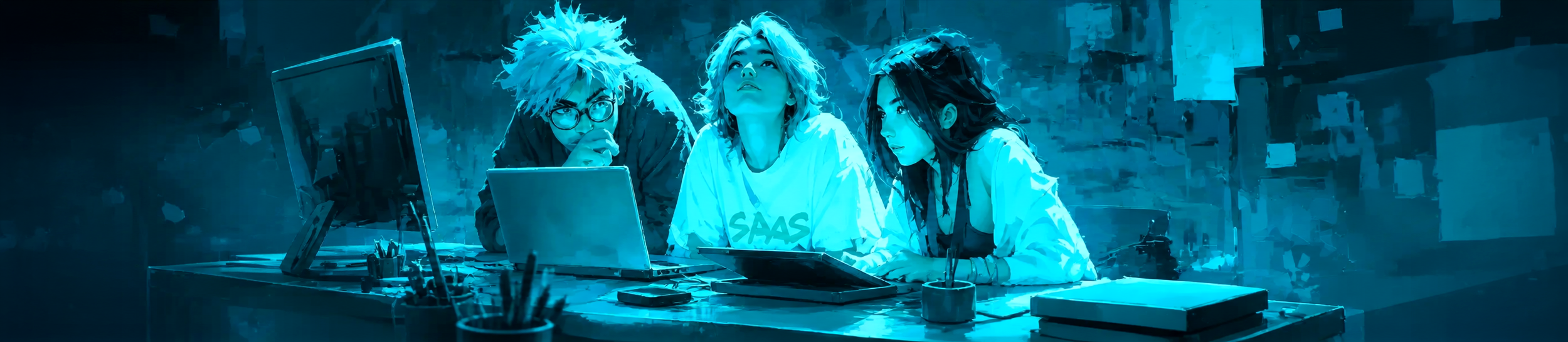
Not every SaaS product needs a redesign immediately. But when the need is real, it is usually obvious. Users hesitate. Screens feel crowded. Teams keep adding functionality without enough structure. Support burden rises. Adoptions crash & burn.
These are not isolated annoyances. They are signs that the experience layer is now limiting the product.
At that point, improving UX is not optional. It becomes a growth decision.
The Skins Factory. 25+ Years. Real Results.
More SaaS UI/UX Resources
Go deeper into the design decisions that shape complex SaaS products, from dashboard hierarchy and scalable design systems to legacy modernization and real SaaS design work.
Enterprise Dashboard UI/UX Design
See how strong dashboard design turns dense data, workflows, and decisions into an interface users can understand quickly.
Explore Dashboard Design Design SystemsThe 2026 B2B SaaS AI Design System Playbook
Learn how reusable components, interaction rules, and shared product logic keep growing SaaS platforms coherent.
Read the Playbook Legacy ModernizationRedesigning Legacy Software Without Disrupting What Works
Modernize an established product while preserving the workflows, familiarity, and business logic existing users rely on.
Explore Legacy Redesign SaaS PortfolioSaaS & Enterprise UI/UX Design
Explore our work designing and modernizing complex SaaS and enterprise products for established companies and ambitious product teams.
See the WorkCommon Questions About SaaS UI/UX Design
Direct answers to the questions product teams ask when evaluating SaaS design patterns, dashboards, redesigns, and UI/UX partners.
What should I look for when hiring a UI/UX agency to redesign my SaaS product?
Look for proven experience designing complex SaaS products rather than marketing websites alone. Review case studies involving dashboards, onboarding, workflows, permissions, design systems, and legacy modernization. Ask who will actually perform the work, how design decisions are validated, and how the agency will modernize the product without disrupting workflows existing users already understand.
What makes a SaaS app design pattern feel premium?
A SaaS design pattern feels premium when it is consistent, restrained, responsive, and carefully resolved across every state. Precise spacing, strong hierarchy, clear typography, thoughtful motion, predictable interactions, and fast performance matter more than decorative effects. A visually expensive interface will not feel premium when its workflows are confusing or its components behave inconsistently.
What are the best SaaS dashboard design patterns for 2026?
The strongest SaaS dashboards use role-based views, clear metric hierarchy, progressive disclosure, persistent filters, contextual actions, and logical drill-down paths. They also account for loading, empty, error, warning, and success states. A dashboard should answer the user's most important questions quickly instead of displaying every available metric at once.
What are the best SaaS chat interface patterns for 2026?
Effective SaaS chat interfaces preserve context, distinguish user and system responses clearly, show processing status, and make mistakes recoverable. Users should be able to edit, retry, stop, continue, or branch a conversation without losing their place. When AI is involved, sources, limitations, and consequential actions should be clearly communicated.
What does clarity mean in SaaS UX design?
Clarity in SaaS UX design means users can look at a screen and immediately understand where they are, what matters most, and what to do next. It comes from deliberate information hierarchy, predictable interactions, reduced cognitive load, and consistent design patterns, not minimalism or white space alone.
What is SaaS UX design?
SaaS UX design is the structure and interaction design of software people use repeatedly to complete workflows, manage data, collaborate, and make decisions. Unlike a marketing website, a SaaS product must remain understandable and efficient across thousands of sessions, multiple user roles, expanding features, and complex application states.
Better UI/UX isn't a nice-to-have.
It's a growth lever.
Products that are easier to use retain users longer. The interface is the retention strategy most companies overlook.
Strong onboarding and clear navigation get users to value faster. Less friction means higher activation rates.
A well-built design system lets your product grow without becoming chaotic. Structure now prevents debt later.
If your product is underperforming, the problem may not be your technology.
It may be your interface. SaaS products live or die by usability - and fixing it changes everything. Click below to complete our product inquiry form. In a rush? Use the quick form below, and we’ll take it from there.Have a project in mind? Let's talk.
Thank you for reaching out.
We will be in touch within one business day.SaaS & Enterprise UX Design Articles
In-depth guides on enterprise UX audits, legacy software redesign, and the common pitfalls of building B2B SaaS and enterprise digital products, from The Skins Factory. See our SaaS UI/UX Design Agency for Enterprise Software page for the complete picture.







SaaS + Enterprise Expertise
SaaS UI/UX Design For Complex B2B & Enterprise Software

The Definitive Guide
The UI/UX Design Guide: How Great Digital Products Actually Get Designed

About Jeff Schader
Jeff Schader is the founder and CEO of The Skins Factory, a UI/UX design studio he started in 2000, based in the Miami/Fort Lauderdale area. He has designed software for some of the biggest names in tech and entertainment, including Microsoft, Disney, the NFL, Bank of America, and Intel, along with SaaS, fintech, healthcare, cybersecurity, and enterprise platforms. Jeff runs The Skins Factory lean and stays hands-on across client work, strategy, and design. He writes about UI/UX, AI interfaces, and what actually makes software usable.
Have a project in mind? Schedule a 30-minute call with Jeff. Jeff also publishes The Product Design Insider on Substack.

Dark mode looks easy but most teams get it wrong. Learn the 5 most common UI/UX mistakes that kill readability and how to fix them.